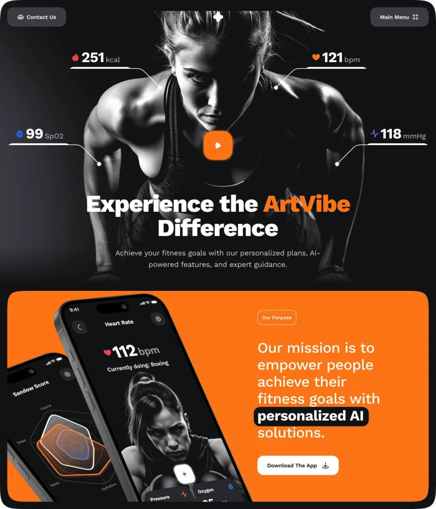
Game-Changing UI/UX Trends In 2025
New design methods and styles emerge every year, influencing how users interact with digital products. For the year 2025, UI/UX trends are focusing on more immersive, intuitive, and delightful experiences than ever before.

We have break down some of the most impactful trends shaping the future of digital interfaces.
1. Immersive Scrolling
Why it matters:
Immersive scrolling turns the user experience into a guided adventure. Instead of overwhelming users with dense information, designers can present content step-by-step. This approach increases user engagement and helps convey complex ideas in simpler, more memorable ways.
You can visit this demo for a live experience.
2. Glassmorphism

Why it matters:
Glassmorphism can bring depth and hierarchy to a design. It helps highlight important content while maintaining a clean, modern look. The user’s attention naturally focuses on the primary content, enhancing clarity and usability.
3. Animated Icons
Why it matters:
Animated icons offer quick feedback and guide user actions. For instance, a download icon could gently bounce to show the user where to click. Subtle animations can also add personality and flair, making the interface more engaging and friendly.
4. Kinetic Typography

Why it matters:
Moving text can draw attention to key messages, improve comprehension, and create a more dynamic feel. Kinetic typography can also help communicate a brand’s tone and personality, making the overall experience more memorable.
5. Bold/Big Typography

Why it matters:
Large type is easier to read and instantly grabs attention. Bold typography ensures that users never miss critical information, making it perfect for headlines, calls-to-action, and branding statements.
6. 3D Elements

Why it matters:
3D adds an extra layer of immersion. Users can visualize products more accurately, interact with objects in a more hands-on way, and feel more connected to what they see on-screen.
7. Minimalism & Simplicity

Why it matters:
Simplicity helps users navigate content easily, reducing cognitive load. In a world filled with noise, minimalistic interfaces provide clarity, making it easier for users to find what they need without feeling overwhelmed.
8. Bold Colour

Why it matters:
Strong colours can help guide the user’s eye to critical elements like buttons or key messages to create memorable visuals. The right colour scheme can also shape the user’s emotional response, reflectingthe brand personality and encouraging interaction.
9. Motion Design

Why it matters:
Motion directs user focus, provides instant feedback, and makes navigation more intuitive. This can improve the overall usability and leave a lasting positive impression.
10. Dark & Light Mode

Why it matters:
Motion directs user focus, provides instant feedback, and makes navigation more intuitive. This can improve the overall usability and leave a lasting positive impression.
Conclusion

Read Common UI/UX Mistakes to avoid making while experimenting with new design styles.


